AI Search
Classic Search
 Search Phrase:
 Search Type:
Advanced search options
 Search in Forums:
 Search in date period:

 Sort Search Results by:

AI Assistant
Notifications
Clear all

Text Area is Too Small on Mobile

9 Posts
2 Users
0 Reactions
2,592 Views
DursunKaptan
Posts: 28
Topic starter
Translate
English
Spanish
French
German
Italian
Portuguese
Russian
Chinese
Japanese
Korean
Arabic
Hindi
Dutch
Polish
Turkish
Vietnamese
Thai
Swedish
Danish
Finnish
Norwegian
Czech
Hungarian
Romanian
Greek
Hebrew
Indonesian
Malay
Ukrainian
Bulgarian
Croatian
Slovak
Slovenian
Serbian
Lithuanian
Latvian
Estonian
(@dursunkaptan)
Eminent Member
Joined: 2 years ago
[#50935]


The text area looks very narrow on mobile. I wonder how we can expand this? - How can I narrow down the rating section at the top left?


8 Replies
DursunKaptan
Posts: 28
Topic starter
Translate
English
Spanish
French
German
Italian
Portuguese
Russian
Chinese
Japanese
Korean
Arabic
Hindi
Dutch
Polish
Turkish
Vietnamese
Thai
Swedish
Danish
Finnish
Norwegian
Czech
Hungarian
Romanian
Greek
Hebrew
Indonesian
Malay
Ukrainian
Bulgarian
Croatian
Slovak
Slovenian
Serbian
Lithuanian
Latvian
Estonian
(@dursunkaptan)
Eminent Member
Joined: 2 years ago

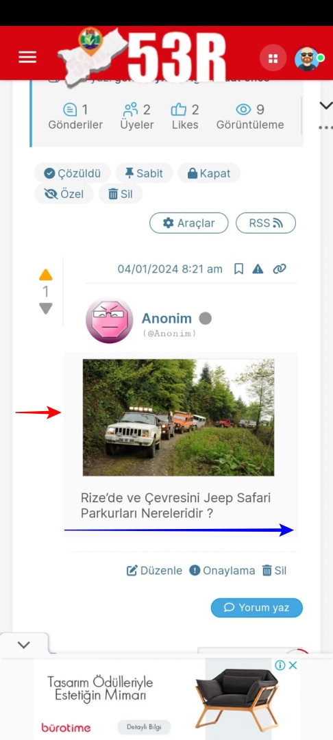
I want to narrow the area I show with the red arrow and expand the area I show with the blue arrow.

Picture Attached

7087 image

Reply
BlackRaz
Posts: 396
Admin
Translate
English
Spanish
French
German
Italian
Portuguese
Russian
Chinese
Japanese
Korean
Arabic
Hindi
Dutch
Polish
Turkish
Vietnamese
Thai
Swedish
Danish
Finnish
Norwegian
Czech
Hungarian
Romanian
Greek
Hebrew
Indonesian
Malay
Ukrainian
Bulgarian
Croatian
Slovak
Slovenian
Serbian
Lithuanian
Latvian
Estonian
(@blackraz)
Contributor
Joined: 9 years ago

Hi  @dursunkaptan 

Add this to custom css

@media screen and (max-width: 680px) {
#wpforo #wpforo-wrap .wpfl-3 .wpforo-post .wpf-left {width: 35px; font-size: 8px !important;}
#wpforo #wpforo-wrap .wpfl-3 .wpf-positive {font-size: 14px;}
#wpforo #wpforo-wrap .wpfl-3 .wpf-negative {font-size: 14px;}
#wpforo #wpforo-wrap .wpfl-3 .wpf-vote-number {font-size: 14px; line-height: 14px;}
#wpforo #wpforo-wrap .wpfl-3 .wpforo-post .wpf-left .wpf-toggle-not-answer {font-size: 18px; padding-top: 2px;}
#wpforo #wpforo-wrap .wpfl-3 .wpforo-post .wpf-right {width: calc(100% - 47px);}
}

Dashboard > wpForo > Settings > Colors & Styles > Custom CSS


Reply
DursunKaptan
Posts: 28
Topic starter
Translate
English
Spanish
French
German
Italian
Portuguese
Russian
Chinese
Japanese
Korean
Arabic
Hindi
Dutch
Polish
Turkish
Vietnamese
Thai
Swedish
Danish
Finnish
Norwegian
Czech
Hungarian
Romanian
Greek
Hebrew
Indonesian
Malay
Ukrainian
Bulgarian
Croatian
Slovak
Slovenian
Serbian
Lithuanian
Latvian
Estonian
(@dursunkaptan)
Eminent Member
Joined: 2 years ago


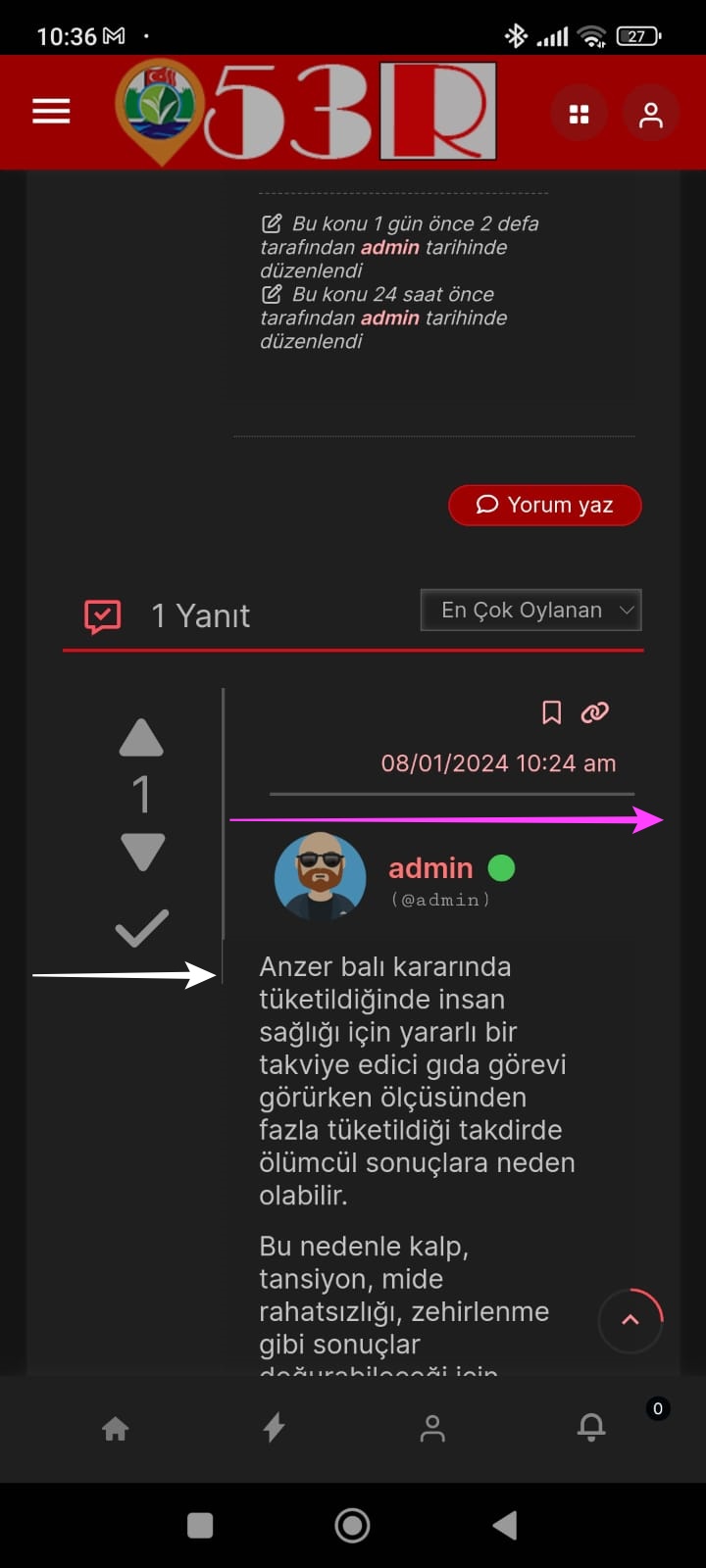
Friend, why does the left area look so wide on this mobile? I don't understand how we couldn't handle this.

The area I show with the white arrow is very wide and the area I show with the pink arrow is very narrow. Isn't there a way to fix this? The area I showed with the white arrow should be close to the edge, enough to fit the up and down buttons there. The text area should be wide, it looks like the words are written one under the other.


WhatsApp Gorsel 2024 01 09 saat 10.38.03 f257fed3

Reply
BlackRaz
Posts: 396
Admin
Translate
English
Spanish
French
German
Italian
Portuguese
Russian
Chinese
Japanese
Korean
Arabic
Hindi
Dutch
Polish
Turkish
Vietnamese
Thai
Swedish
Danish
Finnish
Norwegian
Czech
Hungarian
Romanian
Greek
Hebrew
Indonesian
Malay
Ukrainian
Bulgarian
Croatian
Slovak
Slovenian
Serbian
Lithuanian
Latvian
Estonian
(@blackraz)
Contributor
Joined: 9 years ago

Hi  @dursunkaptan 

I hope you have applied the custom CSS code as needed. If the issue persists after implementing the custom CSS code, please share your website URL and the link to the problematic page. Our developers will investigate the problem, and if necessary, they'll provide a solution. It's possible that the custom CSS code may not have been applied correctly.


Reply
Page 1 / 2
Share: